The Meaning Of Shapes In Psychology And Retail
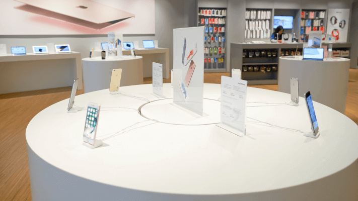
Just like colours, shapes are able to convey subtle messages about your brand. Shapes are seen in retail environments within logos and signage, which can speak volumes about your business. A study found that the shape of physical objects in a store had a profound effect on how the store was viewed by consumers [1].
Angular shapes suggested competence to customers, a feeling which increased when the store was busy. Round shapes and curves suggested friendliness and warmth to customers, which increased when the store was not crowded. Understanding that every shape has a meaning attached to it means that you can design your retail store and POS materials in a way that can increase your sales.
Circles
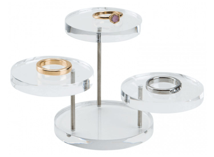
A circle is a perfect unbroken shape that symbolises continuation and flow. It stirs more emotion in consumers than angular shapes, as it seems to suggest friendship, unity and community. Curves have a similar psychological reaction, but are viewed by consumers as being more feminine. Ebster and Garaus say that shoppers prefer shapes that represent their own body shape [2].
Therefore, as a general rule, female shoppers will respond more favourably to curved walls and male shoppers will respond more favourably to straight walls.
A study carried out by a team of scientists at the University of California found that “participants were more likely to judge spaces as beautiful if they were curvilinear rather than rectilinear” [3].
This indicates that if you are running a fashion or furniture store, keeping a circular theme can make your customers perceive your products as more beautiful.
-
Freestanding Display Sphere
FDSPR In stockFrom: £43.81 ex. VATView -
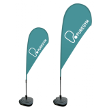
Teardrop Flag with Custom Print
FG3 Despatched in 7-10 working daysFrom: £86.80 ex. VATView -
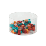
Acrylic Display Tub
ACC In stockFrom: £17.52 ex. VATView -
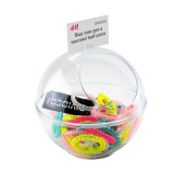
Clear Display Sphere Counter Standing
SPR In stockFrom: £12.97 ex. VATView
Squares and rectangles
Squares and rectangles are angular but sturdy, which is why we associate them with trustworthiness and reliability.
You will often see square logos and branding used by technology and car companies, in order to persuade customers that they can be trusted to sell you high quality, expensive products.
It’s also a common shape that banks use in order to reinforce their professionalism and stability.
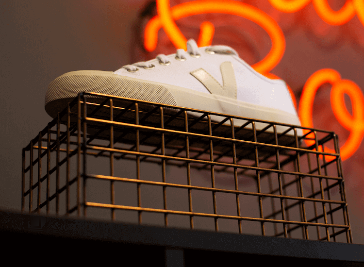
The square wire plinth used in our featured image gives the impression that the trainer perching on top of it has been manufactured to high standards and will last for a long time.
-
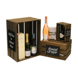
Wooden Display Crate
CRT In stockFrom: £7.85 ex. VATView -
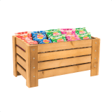
Wooden Crate Dump Bin
WCM In stockFrom: £89.00 ex. VATView -
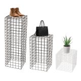
Wire Display Plinth
WDP In stockWas: £69.58 From: £45.00 ex. VATView -
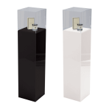
Pedestal Display Case
ADCP In stockFrom: £229.00 ex. VATView -

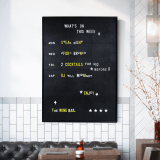
Peg Letter Board
PGBRD In stockFrom: £75.00 ex. VATView -
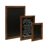
Chalkboard with Dark Wood Frame
CWF In stockFrom: £7.88 ex. VATView -
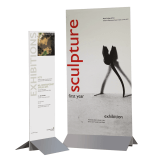
Steel Base Banner Holder
RDD In stockFrom: £15.68 ex. VATView -
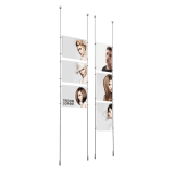
Ceiling to Floor Cable Poster Kit
KB1 In stockFrom: £22.21 ex. VATView
Triangles
Triangles have many subliminal meanings, many of which depend on the type of triangle used and which orientation it is presented in.
Triangles pointed upwards represent movement and have a strong association with businesses that are involved in power, science, religion and law [4].
They have the advantage of looking like an arrowhead, which conveys movement and growth; great if you’re a start-up or rapidly growing company.
Downward pointing triangles also provide direction, but look more unstable. The three-sided nature of a triangular shape can also be used to imply that your business offers a trinity of product ranges.
-
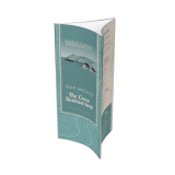
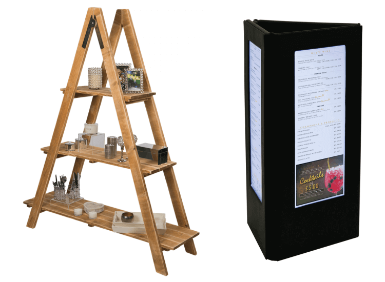
Flat Pack Menu Holder with Three Faces
PS14 In stockFrom: £1.29 ex. VATView -
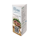
Acrylic Menu Holder with Three Faces
AS11 In stockFrom: £4.93 ex. VATView -
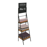
Folding Ladder Shelf Stand With Chalkboard Header
FLS In stockFrom: £224.87 ex. VATView -
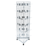
Three Sided Gridwall Stand with Hooks
KGRD6-1 In stockFrom: £115.80 ex. VATView
Polygons
Other multi-sided shapes such as pentagons, hexagons and octagons have many points, which could be used to show the many aspects or services that your brand offers. They are similar to squares and rectangles in the fact that most types of polygons can be stacked and slotted together to form stunning patterns that ooze positive energy and creativity.
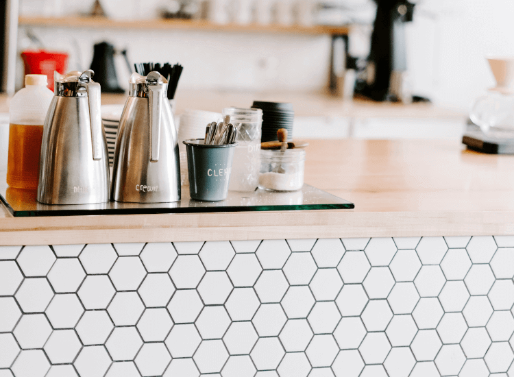
The use of multi-sided shapes in retail environments can imply that your business is robust, has a strong structure and framework behind it. These shapes also look quite futuristic, making them ideal for use by technology companies, fashion stores and eateries that are centred around modernity.
Be aware that shapes also have different cultural significance all around the world, just like colours.
-
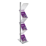
Magazine Zig Zag Brochure Display Stand
ZZ3 In stockFrom: £151.00 ex. VATView -
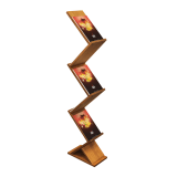
Zig Zag Wooden Leaflet Display Stand
ZZW In stockFrom: £59.78 ex. VATView -
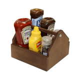
Wooden Condiment Holder
CH01 In stockFrom: £13.95 ex. VATView -
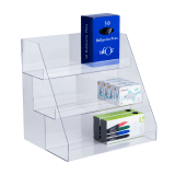
Countertop Acrylic Display Unit
CTM01 In stock£38.90 ex. VATView
Summary
Colours and shapes are two of the most defining factors of a retail environment, so it’s important to take time to consider which combination of designs will work best for your business. In summary of what we have covered in this guide, we advise you to take the following steps:
- Make sure to incorporate your brand’s logo colour into your store design.
- Use the shape of your logo to design the layout of your store and the shape of your displays.
- Use red to highlight sales or ‘action-based’ information to convey urgency.
- Colours that appeal to younger people may not appeal to older customers.
- Make sure that you use a good mix of colours that complement each other, instead of just one colour.
- Be aware of any cultural connotation with colours if you are advertising or have stores in other countries.
A great way to determine which colour schemes and shape designs suit your retail environment is to carry out A/B testing. Use one design for a set period of time and record your sales, then do the same for another design for the same period of time.
This may make it clearer to you which colours, shapes and designs that your specific customers respond to. Why not even carry out a survey of your customers and ask them how you can make your shop design more visually appealing?
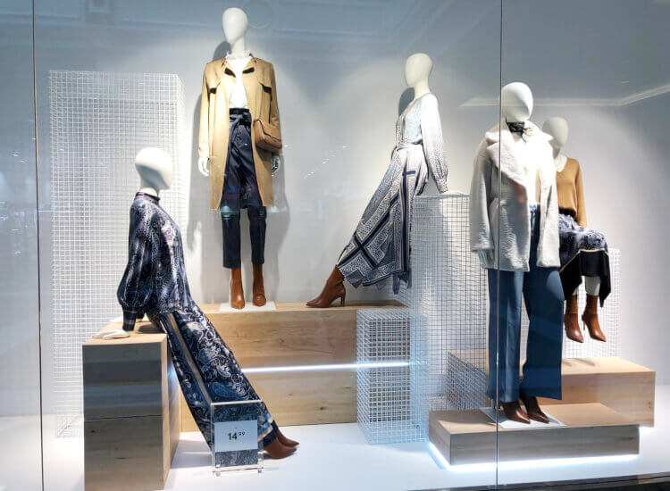
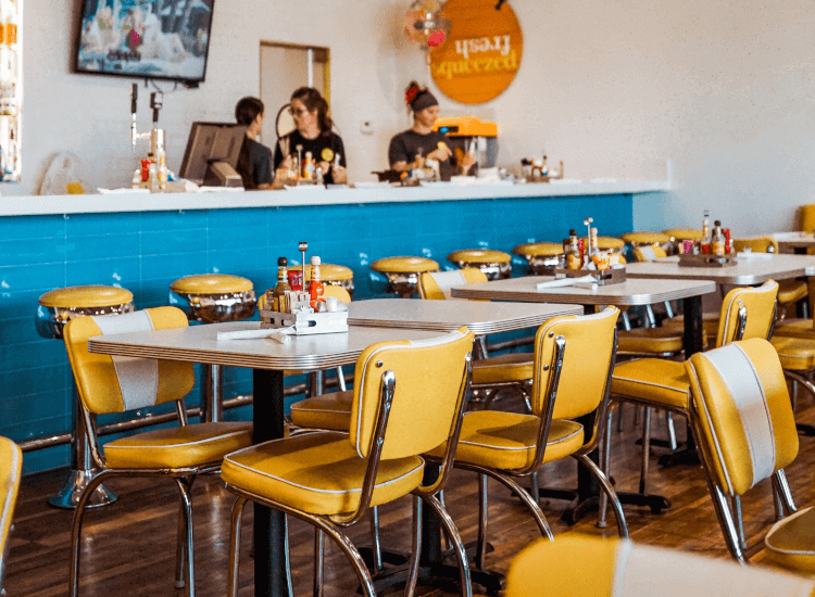
Consistency is key when it comes to branding, as ideally you need consumers to be able to see your logo or signs without any text and still be able to name the brand that it came from.
If you want to make drastic changes, then you will have to do it slowly and in stages. Even the most subtle of design changes can affect how consumers recognise your business.
If everybody used the same colour schemes in their shops then shopping centres would look exactly the same. You need to understand the very essence of your brand’s personality in order to find out which style your customers will respond positively to. The type of product or service that you sell will also determine your final look.
Make sure to read through part one of this guide to explore how colours influence consumer behaviour in store.
References
1.
‘Curves or angles? Shapes in business affect customer response’, Science Daily (2018), retrieved from: https://www.sciencedaily.com/releases/2018/05/180501130737.htm.2.
Ebster & Garaus, ‘Store Design and Visual Merchandising: Creating Store Space That Encourages Buying’, (New York: Business Expert Press, First Edition, 2011) p. 66.3.
Skov et al, ‘Impact of contour on aesthetic judgements and approach-avoidance decisions in architecture’, Proceedings of the National Academy of Sciences (2013), retrieved from: https://www.academia.edu/13016404/Impact_of_contour_on_aesthetic_judgments_and_approach_avoidance_decisions_in_architecture.4.
Oetting, Jami, ‘The Psychology of Logo Design: How Colors, Fonts & Shapes Influence Purchasing Decisions’, Hubspot (2018), retrieved from: https://blog.hubspot.com/agency/psychology-logo-design-infographic.


