How Colour Affects Consumer Behaviour
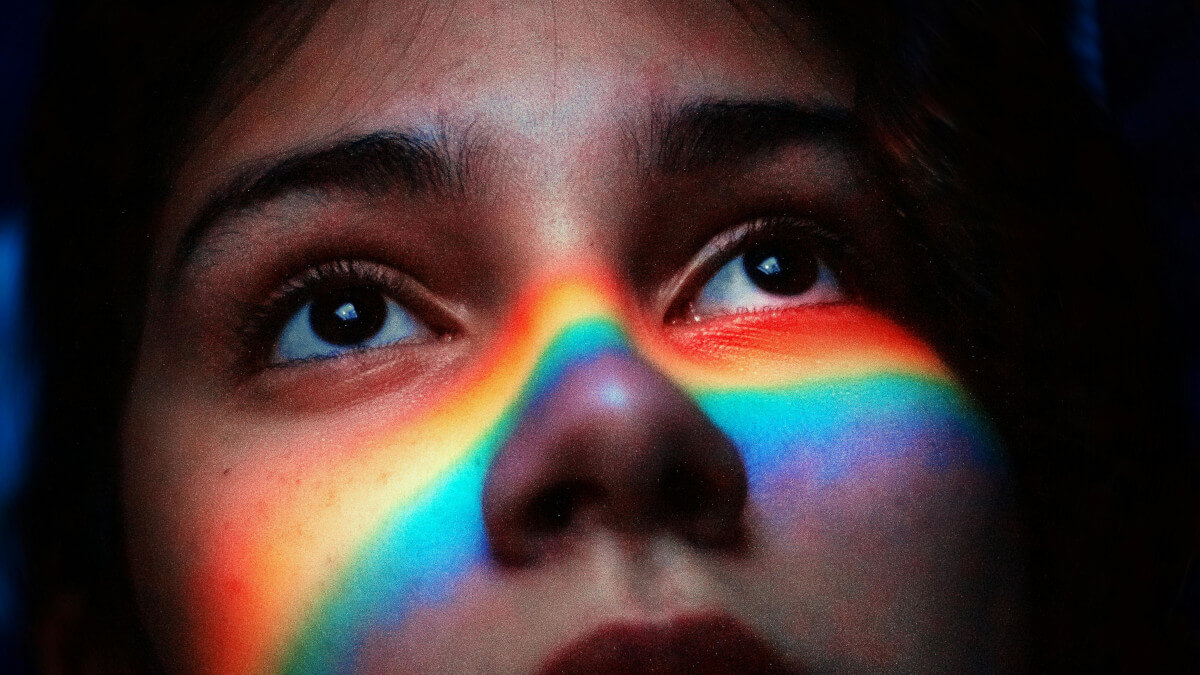
Did you know that advertisements printed in colour are read up to 42% more than advertisements printed in black and white [1]? Colours evoke emotions in people more subtly than words or images, making them an important part of business marketing. Colour is arguably the most important aspect of packaging and advertising, as it's the first thing that consumers will notice, before they process any text or images.
Colour has the power to change our behaviour, with studies showing that green and blue colours can be a hidden factor in encouraging or preventing sleep [2]. We even use colours to describe our moods in everyday life, such as ‘tickled pink’, ‘feeling blue’ and ‘seeing red’.
Colour associations can be subjective, as people will link certain colours with particular feelings based on their past experiences. Nonetheless, there are some generalisations that we can make about the emotions that they evoke, and how we can use a colour scheme in visual merchandising.
The meaning behind a colour scheme in visual merchandising
Just like symbols, the range of colours used in a display can be interpreted and given meanings which often arise from the culture that you have been brought up in. However, according to Ebster & Garaus, “there is little individual difference between persons in terms of their biological reaction to colours” [3]. It's these subconscious reactions that you can tap into in order to create the desired response in your customers.
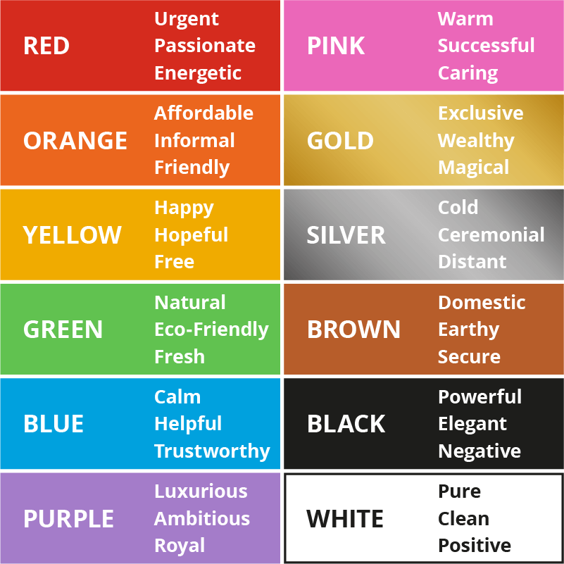
Our colour table gives you a general overview of the significance that colours have to consumers. This, in turn, can help you to identify which colours may be beneficial to use in your store.
As well as the emotions that can be stirred by individual colours, the tone and brightness of colours also makes a difference to consumer reactions.
Warm colours such as yellow, pink and red produce excitement, while cool colours such as blue and white evoke relaxation and peacefulness.
Colour combinations
Combining colours when designing your in store point of sale displays prevents your shop from having an overwhelming effect on your customers, as using too much of the same colour is off-putting. In fact, it's reported that 52% of customers won’t return to a store if they dislike the aesthetic [4].
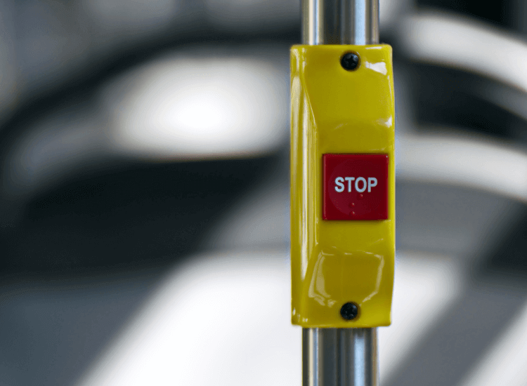
Red and yellow signifies urgency, used effectively to draw travellers' attention to stop buttons on buses and trains.

Red used by itself conveys an order, which is why it is used on road signs that require drivers to take action.
Paradoxically, when colours are combined on the same design, their meanings can change completely. For example, yellow by itself is synonymous with happiness, but when it’s combined with red it can induce anxiety and connote speed. Black can give the impression of elegance, but when it’s combined with red it can trigger a fear response.
-


Red Snap Frame 25mm Frame
PFG12 In stockFrom: £4.50 ex. VATView -

Aluminium Felt Noticeboard
NFA In stockFrom: £44.91 ex. VATView -

Red A Board Pavement Sign A1
ABG12 In stockFrom: £75.77 ex. VATView -

A1 Sale Poster
STCSP In stock£4.62 ex. VATView
How colours affect consumer behaviour in retail
By using colour schemes in store that don’t clash or overwhelm your customers, you can increase the chance that they will like your brand and purchase from you.
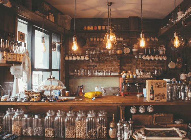
Consumers will make a judgement about a retailer within 90 seconds of entering a store, with 62%-90% of the impressions being made on colour [5].
Studies indicate that warm colours, such as red, orange and pink, are good at attracting potential customers, but can create an unpleasant environment. Conversely, retail stores with mainly blue colour schemes were preferred by customers [6].
Perhaps surprisingly, they also found that a mainly red retail environment was likely to induce more impulse buying from customers.
Blue colours are seen as trustworthy and calm, which is why most major banks use blue colour schemes in their branding.
However, when merchandise is presented in a red environment, it's perceived by the consumer as more up to date. By displaying graphics with different colours, you can subliminally impart emotions onto your customers.
Table 5.4. Effects of a Blue Versus a Red Store Environment
| Blue retail environment | Red retail environment |
|---|---|
| More favourable store evaluation | Less favourable store evaluation |
| Greater shopping intention | Lower excitement and perceived price fairness |
| Greater purchase intention | Lower patronage and purchase intention |
| More impulse purchases |
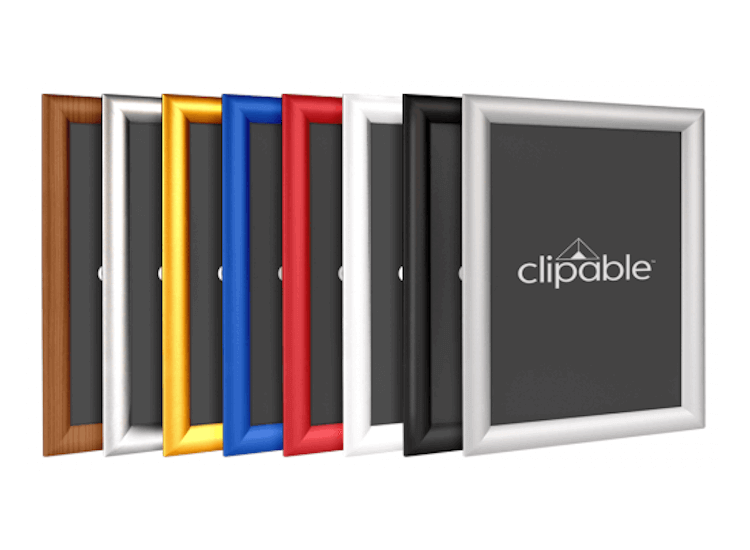
Frame your sale posters in red, new product promotions in stylish chrome or menus in a rustic wood effect.
25mm Snap Frames available in eight different colours and six different paper sizes.
Match your brand logo
Of course it would be silly to design your store with a mainly blue colour scheme when your logo is red, as this would be disorientating for your customers. The same principle applies to any part of your business, both offline and online. Your website should have the same colour schemes as your physical store to maintain consistency.
"Walk into any of the major mobile phone stores and you are instantly taking in their brand colours whether you do it consciously or not." Karen Haller, colour psychology expert
Karen Haller explains: "Imagine the confusion if Vodafone decided to design their stores using yellow or green. You would likely walk out and check the signage thinking you had walked into the wrong store. That kind of mistake could potentially lose them customers over something as simple as not associating their store colour to their brand identity - clearly not a clever business decision" [7].
Use specific colours in your visual merchandising to boost brand recall and recognition. One study showed that the addition of a colourful frame to posters at the point of purchase increased memory levels in customers [8].
Why are sale signs nearly always red?
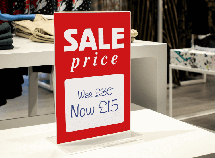
Nearly every single retail shop and ecommerce site uses the colour red in their banners and signs to indicate a sale. Humans are biologically pre-programmed to take action faster when we see red. All speed limit and stop road signs have red in them, as it conveys importance.
Studies have shown that seeing red increases our heart rate, which raises your blood pressure and metabolism [9]. Increased metabolism makes you hungrier, which is why major fast food chains have red colour schemes.
Does age influence colour reactions?
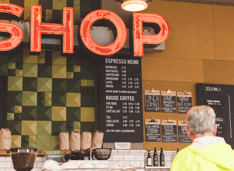
Colour schemes can have different effects on people depending on their age and gender.
Patricia Beks, a marketing and communications specialist, says that “the success of the store depends on how the customer reacts to both the products on display and the sales environment. Younger people like the energy of bold colours; older people prefer more subtle palettes. Get those colours wrong, and a retailer will find that their customers simply won't relate to the brand" [10]. Bear this in mind.
Green is easy for our eyes to process
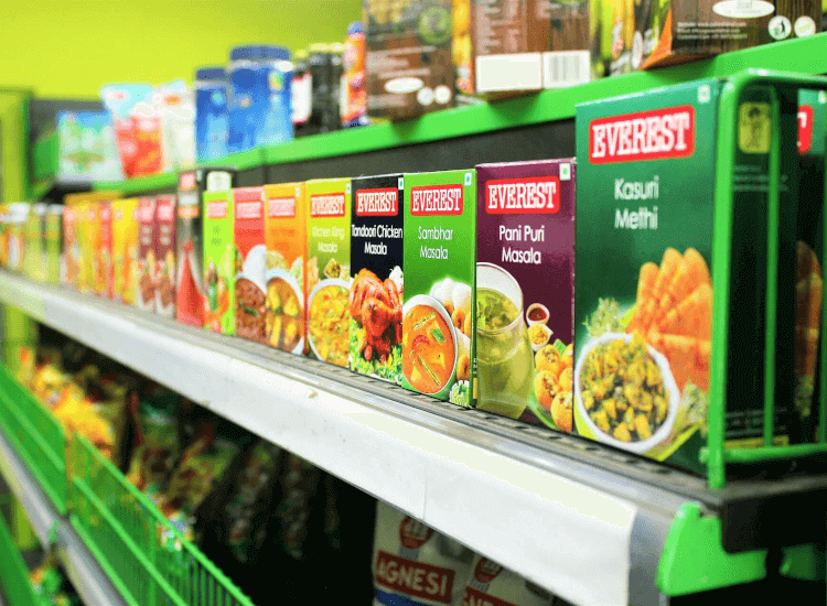
Green colours connect us with nature and induce relaxed feelings, which is why it is commonly used in retail environments where calmness is key, such as pharmacies and health food shops.
Due to the strong ties with nature, green is also hugely popular within garden centres and nurseries, as well as any businesses who want to show off their ethical ‘green’ credentials. Darker greens are able to convey affluence and well-being, which has resulted in luxury brands such as Rolex using these colours in their logo and stores.
Strike a colour balance
The key to creating the store atmosphere that you desire is to strike a balance between the colours that you have chosen so that it is not overwhelming and off-putting for your customers. Sure, you may want to encourage impulse purchases, but simply covering your walls and shelves with bright red signs to do this is not going to work. Select the areas and product lines that you want to draw the most attention to in store, such as your sale sections, then use more red colours in that section.
Most stores have an overarching brand image that they project through all their media, so colours have a huge role to play in this. If you want to convey that your business is approachable, friendly and fun, you may wish to incorporate small amounts of yellow, pink or orange into your colour scheme. On the other hand, if your business sells expensive, luxury goods, then simple black, gold, silver or white colour schemes are probably the best way to go.
Consider the meaning of colours in different cultures
Although we have similar reactions to colours in the western world, these meanings can change depending on where you are on the planet. For example, while in the UK we associate the colour red with either danger or passion, in Asia it is known as a lucky colour.
If your brand is going to be advertising all around the globe, then you will need to take these cultural differences into consideration when designing your point of sale graphics [11].

References
1.
Patil, Daivata, ‘Coloring consumer's psychology using different shades the role of perception of colors by consumers in consumer decision making process: a micro study of select departmental stores in Mumbai city, India’, Journal of Business and Retail Management Research (JBRMR), Vol 7, Issue 1, October 2012.2.
Coughlan, Sean, ‘Cyan colour hidden ingredient in sleep’, BBC, 2018, https://www.bbc.co.uk/news/education-44565320 [accessed Jan 2020].3.
Ebster & Garaus, ‘Store Design and Visual Merchandising: Creating Store Space That Encourages Buying’, (New York: Business Expert Press, First Edition, 2011) p. 129.4.
‘The Psychology of Colors in Marketing’, Small Biz Trends, (2013), https://smallbiztrends.com/wp-content/uploads/2014/06/psychology-of-colors-graphic.jpg [accessed Jan 2020].5.
‘The Psychology of Colour in Retail Design’, Green Room, (2014), https://greenroomdesign.com/blog/the-psychology-of-colour-in-retail-design/ [accessed Jan 2020].6.
Stappenbeld, M, 'The effect of colour and density on the store perception' (B.A. thesis, University of Twente, 2012), pp. 4-6.7.
‘Making colour work for your retail space’, Resene, https://www.resene.co.nz/homeown/use_colr/colours-for-retail-spaces.htm [accessed Jan 2020].8.
‘Reinares-Lara and Martin-Santana ‘Managing point of purchase advertising: effectiveness in terms of recall and recognition’ (2019), Journal of Retailing and Consumer Services, Elsevier, vol. 49(C), pp. 289-296.9.
‘The Psychology of Color’, Psychologist World, https://www.psychologistworld.com/perception/color [accessed Jan 2020].10.
Beks, Patricia, ‘The psychology of color at retail’, Retail Customer Experience (March 2009), https://www.retailcustomerexperience.com/articles/the-psychology-of-color-at-retail/ [accessed Jan 2020].11.
‘Symbolism Of Colors And Color Meanings Around The World’, Shutterstock (April 2015), https://www.shutterstock.com/blog/color-symbolism-and-meanings-around-the-world [accessed Jan 2020].


